
Getting people to visit a landing page is only the first step. The real challenge is turning that attention into clicks, inquiries, sign-ups, bookings, or purchases. A page may look attractive, but if visitors cannot quickly understand the offer or decide what to do next, valuable traffic can disappear without producing results.
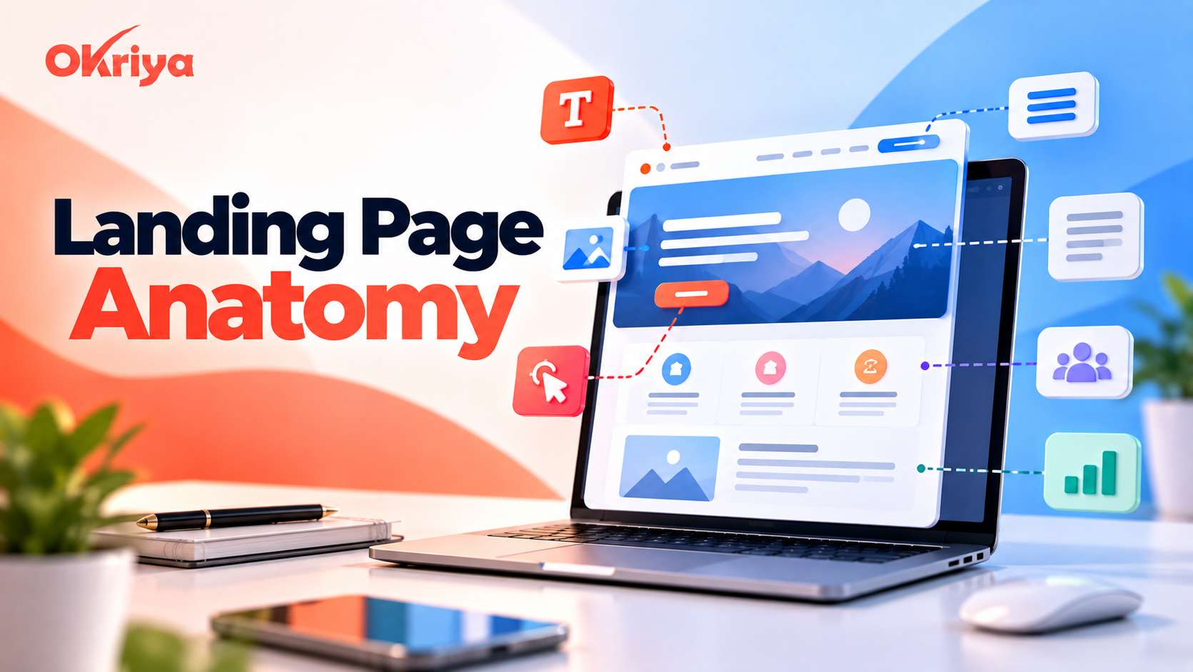
Understanding Landing Page Anatomy helps you organize every important element around a single conversion goal. Instead of adding sections simply because they look good, you create a deliberate journey that moves visitors from interest to trust and finally to action.
A strong Landing Page Anatomy combines clear messaging, focused design, persuasive copy, relevant proof, simple forms, fast performance, and well-positioned calls to action. When these elements work together, the page becomes easier to understand and more convincing to use.
This guide explains 10 essential elements you should consider when building or improving a landing page.
Why Landing Page Anatomy Matters for Conversions
A landing page usually receives visitors who already have some level of interest. They may have clicked an advertisement, email, social post, search result, or campaign link. A well-planned digital marketing strategy should keep the message consistent across those channels and the landing page they lead to.
Good Landing Page Anatomy creates a logical path through the page. The headline introduces the offer, supporting content explains the value, visuals make the message easier to understand, proof reduces doubt, and the CTA gives visitors a clear next step.
When this structure is weak, visitors may experience several problems. They might not understand the offer, struggle to find the main CTA, become distracted by unnecessary links, or hesitate because there is not enough trust information.
The goal is not to fill a landing page with more content. The goal is to include the right information in the right order.
1. Start with a Clear, Intent-Focused Headline
Your headline is one of the first elements visitors notice. It should immediately explain what the page offers and why the visitor should continue reading.
A good headline should connect naturally with the source that brought the user to the page. For example, if an advertisement promotes a free website audit, the landing-page headline should clearly reinforce that offer. Google Ads also recommends closely matching landing-page content with the ad and keywords that brought the visitor there.
This type of message consistency makes Landing Page Anatomy more effective because visitors do not have to guess whether the page matches their original intention.
Write Headlines Around Visitor Value
Avoid headlines that focus only on your company or product features.
Instead of:
Advanced Website Optimization Services
Consider:
Turn More Website Visitors into Qualified Leads
The second version communicates an outcome rather than simply naming a service.
Keep the headline easy to scan and support it with a short subheading when additional explanation is necessary.
2. Build a Focused Hero Section
The hero section introduces the main purpose of the landing page. It normally contains the headline, supporting copy, primary CTA, and a relevant visual.
Visitors should be able to answer three questions within a few seconds:
What is being offered?
Why should I care?
What should I do next?
If these answers are difficult to find, the hero section needs improvement.
Avoid placing too many competing messages above the fold. Multiple offers, excessive navigation, large blocks of text, and unnecessary animations can distract users from the primary conversion goal.
Use Relevant Visuals
The main visual should support the offer rather than simply fill empty space.
Depending on the landing page, useful visuals may include product screenshots, service illustrations, interface previews, before-and-after examples, demonstrations, or images showing the expected result.
The visual and written message should communicate the same idea.
3. Create a Strong Primary Call-to-Action
A landing page needs a clear action. Visitors should never have to search for the button that moves them forward.
Your primary CTA might encourage users to:
-
Request a quote
-
Book a consultation
-
Start a free trial
-
Download a resource
-
Get an audit
-
Create an account
-
View pricing
-
Contact your team
An effective Landing Page Anatomy makes the primary action visually obvious without surrounding it with several unrelated choices.
Use Specific CTA Copy
Avoid vague button text such as:
Submit
Continue
Click Here
Use wording that communicates what happens after the click.
Examples include:
Get My Free Audit
Book a Consultation
Start My Free Trial
Download the Free Guide
Specific CTA copy reduces uncertainty and makes the next step easier to understand.
For longer pages, the same primary CTA can appear again after important sections. You do not need a completely different action every time.
4. Explain Benefits Before Going Too Deep into Features
Visitors usually care more about the result they can achieve than the technical details behind your offer.
Features are still important, but they become more persuasive when connected to a practical benefit.
For example:
Feature: Automated reporting dashboard
Benefit: Spend less time preparing reports manually.
Or:
Feature: Cloud-based file access
Benefit: Access important files from different devices and locations.
Benefit-focused copy helps visitors understand how your product or service fits into their situation.
Make the Copy Easy to Scan
Landing-page visitors rarely read every sentence from beginning to end.
Use short paragraphs, clear headings, descriptive subheadings, simple lists, and visual separation between sections.
A visitor scanning the page should still understand the main offer and its most important benefits.
5. Add Trust Signals and Social Proof
People are less likely to take action when they are uncertain about the company behind an offer. Trust elements help answer the question:
“Why should I believe this?”
Trust is an important part of Landing Page Anatomy, especially when you are asking visitors to provide personal information, schedule a call, make a payment, or commit to a service.
Useful trust elements may include customer testimonials, client logos, ratings, case studies, project results, industry certifications, guarantees, security information, or recognizable partnerships.
Use Relevant Proof
Social proof should be related to the offer whenever possible.
If the page promotes a web development service, a testimonial explaining how a website project improved a client’s business is more useful than an unrelated general compliment.
Similarly, specific results are usually more persuasive than broad statements.
Instead of:
“Great company to work with.”
A stronger testimonial might explain the original problem, what was changed, and what improved afterward.
Authenticity matters more than quantity.
6. Keep Lead Capture Forms Simple
Every additional form field asks the visitor to make another small commitment.
That does not mean every landing page must have a one-field form. It means you should only request information that is genuinely necessary at that stage of the customer journey.
For a simple resource download, an email address might be enough.
A B2B consultation form may reasonably request a name, business email, company information, and a short description of the project.
Reduce Form Friction
Use clear labels and keep related fields together.
Avoid unnecessary questions that your sales team could ask later.
You can also add short reassurance near the form, such as explaining what will happen after submission or how the information will be used.
For example:
“Tell us about your project. Our team will review the details and contact you with the next steps.”
That small explanation makes the process more predictable.
7. Use Visual Hierarchy to Guide Attention
Good design is not just about making a landing page attractive. Professional website design should help visitors understand what deserves attention first and guide them clearly toward the most important action.
Strong Landing Page Anatomy uses typography, spacing, contrast, positioning, images, and content order to create a clear visual hierarchy.
The main headline should look more important than supporting text. The primary CTA should be easier to notice than secondary information. Related content should feel visually connected.
Give Important Elements Space
White space helps separate sections and prevents the page from feeling overwhelming.
Avoid squeezing every available element into the first screen. Give headlines, copy, visuals, forms, and CTAs enough room to breathe.
A focused layout generally makes the page easier to scan and helps visitors move naturally from one section to another.
8. Optimize the Landing Page for Mobile Users
A landing page that works well on desktop can still provide a poor experience on mobile.
Responsive design should be considered from the beginning rather than treated as a final adjustment.
Check that text remains readable, buttons are easy to tap, forms are simple to complete, images scale correctly, and sections do not create unnecessary horizontal scrolling.
Prioritize Mobile Conversion Actions
Important CTAs should remain easy to find on smaller screens.
For some campaigns, a sticky mobile CTA can be useful because the conversion option remains available while the visitor scrolls.
However, sticky elements should not cover important content or make the page uncomfortable to browse.
Always test the complete conversion journey on an actual mobile device, including the form, confirmation message, checkout, booking system, or any page that appears after the CTA.
9. Improve Page Speed and Remove Distractions
Visitors cannot respond to an offer if they are waiting for the page to load.
Speed is therefore directly connected to usability and conversion performance.
An optimized Landing Page Anatomy avoids unnecessary scripts, oversized images, excessive animations, heavy video backgrounds, and other elements that increase load time without adding meaningful value.
Compress images, use appropriate file formats, reduce unnecessary third-party scripts, and review performance regularly.
Remove Unnecessary Exit Points
Landing pages generally work best when they remain focused on one primary goal.
A traditional website navigation menu may encourage visitors to leave the campaign page and explore unrelated sections.
Depending on the purpose of the landing page, you may want to simplify navigation while keeping essential information such as privacy policies, terms, contact details, or required legal links accessible.
Every element should have a reason to exist.
10. Test and Improve the Page Continuously
There is no universal landing-page design that performs best for every audience.
Different visitors respond to different messages, offers, visuals, layouts, and CTAs. Testing helps you learn what actually works for your traffic instead of relying only on assumptions.
Useful elements to test include headlines, subheadings, hero visuals, CTA wording, button placement, form length, testimonials, section order, pricing presentation, and offer positioning.
Test One Important Change at a Time
If you completely redesign several elements simultaneously, it becomes difficult to identify what caused the performance change.
Start with high-impact elements.
For example, test two headline approaches while keeping the rest of the page similar. After collecting enough meaningful data, apply the learning and move to the next test.
Also remember that CTA clicks are not the only metric worth monitoring.
Depending on your goal, you may need to track completed forms, qualified leads, booked meetings, purchases, trial activations, or other actions that happen after the first click.
How to Build a Better Landing Page Anatomy
The strongest pages are not necessarily the longest or most visually complex. They are the pages that communicate clearly and remove unnecessary hesitation.
Before publishing, review your Landing Page Anatomy from the perspective of someone seeing your business for the first time.
Can the visitor immediately identify the offer?
Does the headline match their expectations?
Is the main benefit obvious?
Can they find the CTA quickly?
Is there enough proof to establish trust?
Does the form ask only for necessary information?
Does the page work smoothly on mobile?
Is there anything distracting the visitor from the primary goal?
Answering these questions can reveal weaknesses that are easy to miss during the design process.
Landing Page Anatomy Checklist Before You Publish
Before sending paid or organic traffic to a landing page, check the complete visitor journey. If you are deciding how to attract that traffic, our SEO vs PPC guide explains the differences between organic search and paid advertising in terms of speed, cost, and long-term ROI.
Your headline should make the offer clear. The hero section should provide context and show the primary CTA without requiring unnecessary searching.
The next sections should explain benefits, address common concerns, and provide enough evidence for visitors to trust the offer.
Forms should be simple. Buttons should clearly describe the next action. Visuals should support the message rather than compete with it.
Finally, test the page on desktop and mobile. Complete the form yourself. Click every important button. Check the confirmation experience and make sure analytics or conversion tracking is working correctly.
This final review can catch problems before they affect real campaign traffic.
Common Landing Page Mistakes to Avoid
Even attractive pages can underperform when the structure is unclear.
One common mistake is trying to communicate several offers on the same page. If visitors must choose between booking a consultation, downloading a guide, reading several blog posts, exploring services, and joining a newsletter, the primary goal becomes less obvious.
Another problem is writing too much company-focused copy. Visitors usually want to know how the offer helps them before reading a detailed company story.
Weak CTAs, unnecessary form fields, generic stock images, poor mobile layouts, slow loading times, unsupported claims, and inconsistent messaging can also reduce confidence. Many of these are common website design mistakes that can reduce usability, trust, and conversion performance.
A conversion-focused landing page should make the decision process easier rather than adding more questions.
Final Thoughts
A successful landing page is created through deliberate choices rather than a collection of attractive sections.
Headline clarity attracts attention. Strong benefits create interest. Relevant proof builds confidence. Focused design keeps visitors moving forward. Simple forms reduce resistance, while clear CTAs make the next step obvious.
Once the fundamentals are in place, testing helps you continue improving performance based on real visitor behavior.
Understanding Landing Page Anatomy gives marketers, designers, and business owners a practical framework for evaluating every section of a page. Instead of asking whether a landing page simply looks good, you can ask a more useful question:
Does every element help the visitor understand the offer, trust the business, and take the intended action?
If the answer is yes, you are building a landing page around conversion rather than decoration.
FAQs
What is Landing Page Anatomy?
Landing page anatomy refers to the structure and combination of elements that make up a landing page. These typically include the headline, hero section, value proposition, benefits, CTA, social proof, forms, visuals, trust signals, mobile experience, and other conversion-focused elements.
What should appear at the top of a landing page?
The upper section should normally contain a clear headline, supporting message, primary CTA, and a relevant visual. Visitors should quickly understand what is being offered and what action they can take.
How many CTAs should a landing page have?
A landing page should generally focus on one primary conversion goal. The same CTA can be repeated throughout a longer page so visitors can take action when they are ready.
Should a landing page include a navigation menu?
It depends on the page’s purpose. Campaign landing pages often use limited navigation to reduce distractions, while SEO-focused landing pages may require additional navigation and internal links. The important point is to keep the primary conversion path clear.
How long should a landing page be?
There is no fixed ideal length. A simple offer may need only a short explanation, while an expensive or complex service may require benefits, FAQs, testimonials, case studies, process information, and additional trust elements.
The page should be long enough to answer the visitor’s important questions without adding unnecessary content.
What makes a landing page high converting?
Clear messaging, a relevant offer, strong benefits, visible CTAs, credible proof, simple forms, fast performance, mobile usability, and low distraction all contribute to stronger conversion performance.
How can I improve an existing landing page?
Start by reviewing the headline, hero section, CTA, form, trust elements, mobile experience, and page speed. Use analytics, user behavior data, and controlled tests to identify areas where visitors hesitate or leave.
Should landing pages be optimized for SEO?
Landing pages intended to attract organic search traffic should provide useful content, clear topical relevance, strong on-page structure, internal linking, good performance, and an appropriate search intent match.
Pages created exclusively for short-term paid campaigns may follow a different strategy depending on whether they are intended to appear in organic search results.