
Your landing page can make or break your marketing campaigns. You might get plenty of ad clicks, but if your page is not structured correctly, visitors leave without taking action. A high-CTR landing page guides users clearly, builds trust, and pushes them toward the next step.
In this guide, we break down the 10 essential elements every landing page needs to lift click-through rates. From headlines that match user intent to trust signals and CTA placement, you will learn exactly what drives visitors to click. Use this checklist to turn more of your traffic into qualified leads and get the most out of every click.
Why Does Landing Page Structure Matter for Click-Through Rates?
Every click you pay for is a potential customer. But if your landing page is confusing, cluttered, or slow, most visitors will leave before taking action. This is why page structure matters — it guides users from the first impression to the call-to-action without distraction.
Click-through rate (CTR) measures the percentage of visitors who click on your primary CTA. Even a small lift can have a big impact on ROI. For example, improving CTR from 3% to 4% means 33% more leads from the same traffic and budget. A well-structured landing page ensures your ad spend is not wasted and that every visitor has a clear path to conversion.
1. Headline That Matches Search Intent and Ad Copy
Your headline is the very first thing a visitor sees, and it determines whether they stay or leave. A strong landing page headline grabs attention, confirms to the user that they are in the right place, and clearly communicates the value of your offer.
Match Ad Copy or Keyword
If your ad says “Free CRM Demo,” the headline should repeat that promise. This creates message match, which reassures visitors that they clicked the right link. When there is a disconnect between the ad and landing page headline, bounce rates climb and CTR drops.
Focus on Benefits, Not Just Features
The best headlines answer the visitor’s core question: “What’s in it for me?” Instead of writing “Our New Software Update is Here,” say “Save 10 Hours a Week with Our Faster, Smarter Software.” Benefit-driven headlines are more persuasive and drive more clicks.
Keep It Short and Scannable
Aim for 8–12 words. Long, complicated headlines overwhelm users and get skipped. A concise headline with a clear subheadline works best. Example:
Headline: “Get a Free Landing Page Audit”
Subheadline: “Find out what’s hurting your conversion rate in under 24 hours.”
Use Power Words and Emotional Triggers
Words like “Free,” “Proven,” “Exclusive,” and “Today” grab attention and create urgency. Emotional language can increase engagement and push users to take action.
Test Your Headlines
Use A/B testing tools to try different variations. Test benefit-first vs. feature-first headlines, question headlines vs. statement headlines, and emotional vs. neutral copy. Even small changes can lift CTR significantly.
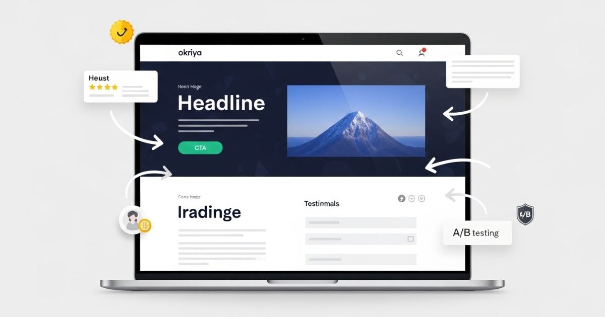
2. High-Impact Hero Section Above the Fold
Your hero section is the first visual impression a visitor gets, and it sets the tone for the entire page. It lives “above the fold,” meaning users see it without scrolling. A high-performing hero section captures attention, communicates value instantly, and guides users toward the next step.
Show Value Immediately
Your hero section should make it crystal clear what the page offers within the first few seconds. Pair your headline with a supportive subheadline that explains why users should care. Example:
Headline: “Launch High-Converting Campaigns Faster”
Subheadline: “Our done-for-you landing page templates help you go live in hours, not days.”
Use High-Quality Visuals
Hero images or videos should reinforce your message, not distract from it. Show your product in use, a happy customer, or the outcome your audience wants. Avoid generic stock photos — they lower trust.
Place Your Primary CTA Above the Fold
Don’t make users scroll to find your call-to-action. Buttons like “Get Started,” “Book a Demo,” or “Download Free Guide” should be prominently visible.
Keep It Clean and Focused
Your hero area should be free of clutter. Avoid multiple competing messages, too many links, or overwhelming animations. A clean, minimal hero section keeps users focused on the action you want them to take.
Make It Mobile-Friendly
On mobile, your hero section is often the only thing users see before bouncing. Ensure text is legible, images scale properly, and CTA buttons are easy to tap without zooming.
Test and Refine
Experiment with hero layouts: full-width image vs. illustration, video background vs. static image. Track scroll depth and click heatmaps to see if users engage or drop off after seeing your hero section.
3. Action-Oriented Call-to-Action (CTA) Buttons
Your call-to-action (CTA) button is the tipping point where a visitor turns into a lead or customer. A well-designed, persuasive CTA can dramatically increase click-through rates, while a weak one can waste all your ad spend.
Make Your CTA Stand Out
Your CTA button should visually pop off the page. Use a color that contrasts with your background and brand palette but still feels cohesive. The goal is to make it the most noticeable element on the page without being jarring.
Use Action-Oriented Copy
Generic buttons like “Submit” or “Click Here” don’t inspire clicks. Instead, write copy that tells users exactly what they’ll get. Examples:
- “Get My Free Audit”
- “Start My Free Trial”
- “Download the Guide”
- “See Plans and Pricing”
Action-driven microcopy reassures users and reinforces the value of clicking.
Place CTAs Strategically
Your primary CTA should appear above the fold so it’s visible immediately. For longer landing pages, repeat the CTA strategically after key sections (benefits, testimonials, pricing). This ensures users always have a clear next step when they’re ready to act.
Size and Spacing Matter
Your button should be large enough to notice and easy to click on desktop and mobile. Add plenty of white space around it to draw focus. Avoid cramming it between other elements — give it breathing room.
Reduce Friction Around the CTA
If your CTA leads to a form, keep the form short. If it leads to a checkout, make sure the process is simple and secure. The smoother the path after the click, the more likely users are to convert.
Test Different Variations
A/B test button colors, copy, and placement. Sometimes a small change like switching from “Get Started” to “Get Started Free” can significantly lift CTR. Use tools like Google Optimize, VWO, or HubSpot to measure results.
4. Benefit-Focused Landing Page Copywriting
Your landing page copy should do more than describe your product — it should convince visitors why taking action will improve their lives or solve their problems. Benefit-focused copy bridges the gap between what you offer and why it matters.
Lead with Benefits, Not Features
Features tell what your product does. Benefits tell what the visitor gets. For example:
- Feature: “Includes 20GB of cloud storage.”
- Benefit: “Store all your files safely and access them from anywhere.”
Benefits connect emotionally and make clicking your CTA feel like progress toward a goal.
Make It About the User
Use “you” and “your” language to speak directly to the visitor. This creates a conversation and keeps the focus on their needs.
Instead of saying, “Our software automates workflows,” say, “You’ll save hours each week by automating repetitive tasks.”
Keep It Clear and Scannable
Visitors skim. Break text into short paragraphs and bullet points. Highlight key benefits in bold or with icons so users can quickly see why they should click.
Use Persuasive Techniques
- Social Proof: “Trusted by 5,000+ marketers.”
- Urgency: “Limited spots available for this month.”
- Specificity: “Increase your CTR by 27% in 30 days.”
These techniques reduce hesitation and push visitors closer to conversion.
Support Copy with Visuals
Pair benefits with icons, images, or screenshots that reinforce your message. This helps users process information faster and makes your page feel professional.
Test and Iterate
Try different approaches — long-form copy vs. concise copy, storytelling vs. direct benefits — and see which resonates with your audience. Monitor time-on-page and conversion rates to guide your adjustments.
5. Social Proof and Trust Signals to Boost Conversions
Even the best headline and copy can fail if visitors don’t trust you. Social proof shows that other people — ideally people like your target audience — have already taken action and had a positive experience. Trust signals reassure users that clicking is safe and worthwhile.
Use Testimonials Strategically
Include short, authentic quotes from real customers. Pair them with names, photos, and job titles (with permission) to make them credible. Example:
“After using [Product], our sign-ups doubled in three months. The process was seamless.”
— Sarah P., Growth Marketer at SaaSCo
Place testimonials near CTAs or sections where users might hesitate.
Show Customer Logos or Numbers
If you serve well-known brands, display their logos. If not, highlight numbers:
- “Trusted by 5,000+ businesses worldwide”
- “Over 1 million campaigns launched with our platform”
These create instant authority.
Add Reviews, Ratings, or Case Studies
Show Google star ratings, G2 or Trustpilot reviews, or link to in-depth case studies. This gives visitors more confidence to click and explore.
Include Security and Guarantee Badges
If you are collecting user data or payments, display SSL badges, money-back guarantees, or compliance logos (GDPR, PCI). These reduce risk perception and encourage clicks.
Use Social Proof Without Overloading the Page
Too much social proof can overwhelm or distract. Select your strongest, most relevant examples and place them near key conversion points.
Keep It Fresh
Update testimonials and reviews regularly so they reflect current results. Outdated social proof can hurt credibility.
6. Simple, Optimized Lead Capture Forms
Your form is the bridge between a visitor’s interest and your conversion goal. A complicated or overwhelming form can destroy your click-through rate, no matter how strong the rest of your landing page is.
Keep Forms Short and Relevant
Only ask for the information you truly need at this stage. If your goal is a newsletter signup, a single email field is enough. For lead generation, name + email + company might work, but avoid long forms unless absolutely necessary. Each additional field can lower conversions.
Use Multi-Step Forms for Complex Data
If you need more information, break it into steps. For example:
- Step 1: Name and email
- Step 2: Business details
- Step 3: Additional questions
Multi-step forms feel easier to complete and often outperform long single-page forms.
Make the Form Visually Clear
Use generous spacing, clear labels, and a clean design. Align fields vertically to guide the eye downward. Group related fields together.
Place Forms Strategically
For short landing pages, keep your form above the fold. For longer pages, repeat the form or add a sticky CTA that scrolls with the user so they can sign up whenever they’re ready.
Add Microcopy for Reassurance
Small bits of text under fields can reduce anxiety. Examples:
- “We’ll never share your email.”
- “Takes less than 30 seconds to complete.”
These help users feel safe and confident.
Optimize for Mobile Users
Use large tap targets and auto-fill features so users can complete forms quickly on smaller screens. Test your form experience on multiple devices before publishing.
Test, Measure, Improve
Run A/B tests on form length, button copy, and placement. Monitor completion rates and drop-offs. Small improvements in form performance can have a major impact on your CTR and overall ROI.
7. Visual Hierarchy and Clean Landing Page Design
A landing page isn’t just about what you say — it’s about how you present it. Good design guides the visitor’s eyes from the headline to the CTA without confusion. A strong visual hierarchy ensures every element has a purpose and leads users toward taking action.
Guide the Eye with Layout
Arrange content so users can quickly understand what’s most important. Place your headline at the top, supporting copy directly below, and your CTA button in a clear, prominent spot. Use F-pattern or Z-pattern layouts to match natural eye movement.
Use Contrast and White Space
Contrast draws attention to key elements like CTAs. White space gives breathing room, reduces visual noise, and makes the page feel professional. A cluttered design can overwhelm visitors and lower click-through rates.
Create a Clear Visual Flow
Use headings, subheadings, and bullet points to break text into digestible chunks. Each section should naturally lead to the next, guiding users closer to the CTA as they scroll.
Prioritize Above-the-Fold Content
Make sure your most important message and CTA are visible without scrolling. Users should understand the offer in the first few seconds.
Remove Unnecessary Distractions
Minimize navigation menus, pop-ups, and links that pull users away from the main goal. Every extra click path increases the chance of losing the conversion.
Design for Accessibility
Choose readable font sizes, high-contrast text, and mobile-friendly layouts. Ensure that everyone, including users with visual impairments, can easily consume and act on your content.
Use Visual Cues
Directional cues like arrows, highlighted sections, or images of people looking toward the CTA can subtly direct attention where you want it.
8. Mobile-Optimized Landing Pages and Fast Load Speed
More than half of web traffic now comes from mobile devices. If your landing page is slow or poorly designed for mobile, you lose visitors before they even see your offer. A mobile-optimized, fast-loading page keeps users engaged and drives more clicks.
Prioritize Speed
Every second counts. A 1-second delay in load time can drop conversions by as much as 7%. Compress images, minify code, and use a content delivery network (CDN) to improve performance. Test your page with tools like Google PageSpeed Insights or GTmetrix to ensure it loads in under 2 seconds.
Use Mobile-First Design
Design your landing page for small screens first, then scale up for desktop. Ensure that headlines, buttons, and forms are legible without zooming or horizontal scrolling.
Optimize Tap Targets
Make buttons large enough for easy tapping and space them out so users don’t accidentally click the wrong element.
Keep Content Concise
Mobile users scroll more but read less. Use short, focused copy and strong headlines that quickly communicate value.
Sticky CTAs for Mobile
Consider using a sticky footer with your CTA so users can convert without having to scroll back to the top or bottom.
Test Across Devices
Preview your landing page on different screen sizes and browsers. What looks great on a desktop monitor might be hard to use on a phone.
Monitor Mobile Performance
Track mobile-specific metrics like bounce rate, time on page, and conversion rate. If mobile numbers are low, focus your optimization efforts there first — mobile visitors are often the majority of your audience.
9. Consistent Branding and Message Match for Trust
Visitors decide in seconds whether to trust your landing page. Consistent branding and message match create a seamless experience from the ad click to the page view, which reassures users they’re in the right place and encourages them to take action.
Match Your Ad Copy to the Landing Page
If your ad promises “Free Consultation,” your headline should repeat that phrase or a very close variation. This message match reassures visitors that the page will deliver what they expected. A mismatch creates confusion and leads to higher bounce rates.
Keep Visual Branding Consistent
Use the same colors, fonts, and tone of imagery across your ads, landing pages, and thank-you pages. Consistency builds recognition and trust — especially for first-time visitors.
Align Voice and Tone
If your ad uses friendly, casual language, your landing page should use the same tone. Sudden shifts in style can make your brand feel disjointed and hurt credibility.
Reinforce Brand Identity
Subtle elements like your logo placement, favicon, and footer links help visitors feel they’re dealing with a legitimate business. This is especially important if you’re collecting personal data or payments.
Check Your Thank-You Page
After a conversion, send users to a thank-you page that feels like a natural extension of the landing page. This maintains trust and gives you an opportunity to offer the next step (download link, scheduling tool, upsell).
10. Continuous A/B Testing for Landing Page Optimization
Even the best landing page can perform better with continuous improvement. A/B testing lets you experiment with different versions of headlines, CTAs, layouts, and visuals to find what gets the highest click-through rates and conversions.
Start with High-Impact Elements
Test one element at a time so you know what caused the change. Begin with:
- Headlines: Test benefit-driven vs. feature-driven messaging.
- CTA Buttons: Try different colors, sizes, and copy like “Get Started” vs. “Start Free Trial.”
- Hero Images: Compare product mockups vs. lifestyle imagery.
Run Tests Long Enough
Collect enough data before deciding a winner. Stopping too early can give misleading results. Aim for statistical significance — most tools like Google Optimize, VWO, or Optimizely calculate this automatically.
Measure More Than CTR
While CTR is important, look at downstream metrics like form completions, purchases, or sign-ups. A variant with slightly lower CTR but higher final conversions may be the true winner.
Document and Apply Learnings
Track what works and build a library of insights. If a headline formula consistently outperforms others, apply it to future landing pages.
Keep Iterating
Optimization is never finished. Regularly revisit your landing pages and test new ideas based on user behavior, market trends, and feedback. Continuous testing can compound results over time, turning a good landing page into a top-performing conversion engine.
How Can You Optimize Your Landing Page for Higher CTR Today?
You now know the 10 elements that make a landing page perform, but the real impact comes from putting them into practice. Start by auditing one of your top-performing campaigns. Open the landing page and ask:
- Does the headline immediately confirm what the ad promised?
- Is the primary CTA visible without scrolling?
- Are there unnecessary fields or distractions that slow the visitor down?
- Is the page fast and easy to use on mobile?
- Do testimonials, trust badges, and visual cues make clicking feel safe?
Make small, high-impact changes first — adjust a headline, rewrite the CTA, simplify the form. Monitor click-through rates and conversion rates for at least two weeks, then test another element.
If you want a sharper competitive edge, bring in outside perspective. At Okriya, we analyze landing pages with conversion data, heatmaps, and user flow insights. This allows us to find the hidden bottlenecks that most teams miss and rebuild pages that convert at a higher rate without wasting ad spend.
A single percentage point lift in CTR can translate into thousands of dollars in additional revenue over the course of a campaign. Now is the time to refine, test, and turn your landing page into a consistent driver of results.
FAQs
What is a good click-through rate (CTR) for a landing page?
A good CTR depends on the industry and offer, but most high-performing landing pages see CTRs between 3% and 10%. If you are below 2%, review your headline, CTA placement, and form length.
How many CTAs should a landing page have?
One primary CTA is ideal to keep users focused, but you can repeat it in multiple places on a long page. Use secondary CTAs sparingly and only if they support the same conversion goal.
Should a landing page have navigation links?
In most cases, no. Removing navigation reduces distractions and keeps users on the page. If you must include navigation, limit it to essential links like privacy policy or terms of service.
What is the best length for a landing page?
The right length depends on the complexity of your offer. Simple offers (newsletter signups, free trials) often perform better on short pages. High-ticket products or services usually require longer pages with more proof and detail.
How often should I test my landing page?
Test continuously. Start with major elements like headlines and CTAs, then move to images and layouts. Revisit pages quarterly to ensure they are still aligned with user behavior and market trends.
Do landing pages affect SEO?
Yes, if they are indexable and optimized. Use relevant keywords in your headline and copy, ensure fast load speed, and provide enough value that users stay engaged. Even if the page is used mainly for ads, a well-optimized page improves Quality Score and lowers CPC.
What tools can help me improve CTR?
Tools like Google Optimize, VWO, Hotjar, and Crazy Egg can show where users click, scroll, or drop off. This data helps you make informed changes instead of guessing.
Should I design landing pages for desktop or mobile first?
Always design mobile first. Most traffic now comes from mobile devices, and a page that works flawlessly on small screens will scale up nicely to desktop.