

A good website keeps visitors interested. A bad one pushes them away fast. Many small design mistakes make users leave even before they read your message. Slow pages, poor layout, or confusing buttons reduce trust and sales. When a visitor feels lost, they close the tab. Design is not only about colors or shapes. It is about comfort, clarity, and flow. Every element must help users reach what they want without thinking too much.
This guide explains ten common website design mistakes that can hurt your traffic and conversions. You will also learn simple ways to fix them and make your website friendly, clear, and ready to grow your online success.
1. Slow Page Speed
A slow website makes visitors leave before they see your content. When a page takes more than three seconds to load, the bounce rate increases, and search ranking drops. Google uses Core Web Vitals like Largest Contentful Paint and First Input Delay to measure how fast a page responds. Slow websites also score low on Google PageSpeed Insights, which affects visibility.
The main reasons for slow speed are large images, poor hosting, and heavy JavaScript. Unused CSS files and uncompressed media add more load time. To fix this, use image compression tools such as TinyPNG, enable browser caching, and use a Content Delivery Network (CDN) like Cloudflare. A fast website improves user experience, SEO performance, and conversion rate.
2. Confusing Navigation
Visitors lose trust when they cannot find information fast. Clear navigation helps both users and search engines understand a website’s structure. Menus, headers, and internal links create a site architecture that guides movement between pages. When links are hidden or labels are unclear, users stop exploring.
Poor navigation also hurts crawlability because search bots depend on internal linking to discover content. Terms like breadcrumb trails, sitemap.xml, and URL hierarchy connect user experience with SEO. Simple, descriptive labels such as “Services,” “Portfolio,” and “Contact” improve clarity.
Website builders like WordPress, Wix, or Webflow allow easy menu organization. Keep the top menu short. Group similar pages under categories. Add a visible search bar. Organized navigation builds confidence and keeps users longer on the website.
3. Poor Mobile Experience
Mobile users expect smooth browsing on any device. Websites that fail Google’s Mobile-Friendly Test lose visitors quickly. Responsive design ensures that every element, such as text, images, and buttons, adjusts to screen size. Without it, users pinch and scroll, which increases frustration and bounce rate.
Most issues come from fixed layouts, tiny fonts, and buttons placed too close. Using CSS media queries and flexbox layouts helps create flexible designs. Mobile optimization also improves Core Web Vitals, especially Cumulative Layout Shift and Interaction to Next Paint.
Testing on multiple devices with tools like BrowserStack or Google Search Console’s Mobile Usability Report shows real issues. Fast-loading, finger-friendly, and readable pages build trust and keep mobile users engaged.
4. Cluttered Layout and Weak Visual Hierarchy
Users scan pages before reading. Poor layout breaks this flow. Crowded screens confuse the eye and hide key messages. Clean design builds trust and guides attention toward actions.
Visual hierarchy decides what users see first. Designers use color contrast, font weight, and element spacing to lead the eye. Without hierarchy, call-to-action buttons lose impact. Pages filled with banners, ads, and popups lower engagement and raise exit rate.
Effective layout uses white space, grid systems, and consistent typography. Tools like Figma and Adobe XD help organize visual balance. Each section must have one clear purpose. Every image, line, and button must support that goal. A clean, structured page helps visitors stay longer and convert better.
5. Hard-to-Read Text
Visitors trust websites that look clear and easy to read. Poor typography reduces readability and makes users leave fast. Text that is too small or too light causes eye strain. Weak contrast between background and font color hides information. Readability also affects accessibility, a key factor in WCAG (Web Content Accessibility Guidelines).
Designers use typographic hierarchy to control flow. Strong headings, proper line spacing, and short paragraphs guide readers smoothly. Tools like Google Fonts and Typekit provide legible, web-safe font families. Recommended base font size stays between 16px and 18px for body text.
Contrast checkers such as WebAIM Color Contrast Checker confirm if text meets accessibility standards. Clean typography improves user experience, boosts retention, and supports better search engine optimization.
6. Intrusive Popups and Auto-Play Media
Users visit websites to read or explore, not to close popups or stop videos. Intrusive elements break focus and increase the bounce rate. Search engines track these negative signals through Core Web Vitals metrics like Interaction to Next Paint. Sites that show constant interruptions lose both traffic and conversions.
Smart use of popups improves results. Trigger popups after user engagement, not on entry. Add exit-intent technology or scroll-based triggers for better timing. Always include a clear close button. Avoid sound-on auto-play videos because they raise Time to Interactive (TTI) and slow down the page.
Webmasters can control display behavior through Google Tag Manager and JavaScript event listeners. Clean, respectful interaction keeps users focused and creates a smooth user experience across all devices.
7. Weak or Hidden Calls to Action
Visitors need clear direction to take action. Weak or hidden calls to action (CTAs) confuse users and reduce conversions. Every page must guide visitors toward a specific goal such as contacting, purchasing, or subscribing. Strong CTAs turn traffic into leads and sales.
Designers use conversion rate optimization (CRO) principles to improve engagement. Clear verbs like “Get a Quote” or “Start Free Trial” tell users exactly what happens next. Bright colors, bold typography, and strategic placement increase click-through rate (CTR).
Tools such as Hotjar and Google Analytics reveal where users click and where they stop. Testing multiple button texts through A/B testing on platforms like Google Optimize or Optimizely helps find the best message. Clear, visible CTAs drive action and support strong business growth.
8. Generic or Irrelevant Images
Visual content builds trust faster than text. Generic or irrelevant images weaken that trust and make a website look fake. Visitors recognize overused stock photos easily. When images fail to match the message, the bounce rate rises and conversion rate drops.
High-quality visuals improve both design and search engine optimization (SEO). Real product photos, team portraits, and project snapshots increase authenticity. Designers use alt text, file naming conventions, and structured data markup to help Google Image Search understand image context.
Image optimization tools like TinyPNG, ShortPixel, and ImageOptim reduce file size without lowering quality. Proper use of WebP format and lazy loading also improves Core Web Vitals performance. Authentic visuals with clear purpose strengthen brand identity and user trust.
9. Missing Trust Elements
Users buy only when they feel safe. Missing trust elements make a website look risky and unprofessional. Visitors search for signals that confirm credibility before sharing personal data or making payments. When they cannot find proof, they leave fast and never return.
Trust elements include SSL certificates, privacy policies, testimonials, and social proof. Security layers like HTTPS encryption protect user information and improve ranking signals on Google Search. Displaying client logos, Google Reviews, and verified badges from Trustpilot or Clutch increases reliability.
Business websites must also show visible contact information, About Us pages, and secure payment gateways such as Stripe or PayPal. These components send strong trust signals to both users and search engines. Authentic credibility builds confidence and drives higher conversions.
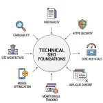
10. Ignoring Basic SEO Principles
Search engines understand a website through structure and content. Ignoring SEO blocks visibility and reduces organic traffic. Pages without meta titles, meta descriptions, or proper heading hierarchy (H1–H3) confuse both users and crawlers. Broken links and duplicate content weaken crawl budget and waste indexing capacity.
Strong on-page optimization improves rankings and user experience. Writers and webmasters must add target keywords, internal links, and schema markup to help Googlebot read context correctly. Using canonical tags prevents duplication. Tools like Google Search Console, Ahrefs, and Screaming Frog identify missing metadata and indexing issues.
Each image needs alt attributes, and every page requires a robots.txt and XML sitemap for easier crawling. Correct SEO foundations support design quality, strengthen authority, and attract consistent search visibility.
Essential Checklist to Fix Website Design Mistakes
This checklist helps review and fix website design issues fast. Each point connects directly with user experience (UX), search engine optimization (SEO), and conversion rate optimization (CRO). Use it to audit every page and improve performance step by step.
Page Speed Optimization
- Compress all images with TinyPNG or ShortPixel.
- Minify CSS, JavaScript, and HTML using Gulp or Webpack.
- Enable browser caching and use a Content Delivery Network (CDN) like Cloudflare.
- Test with Google PageSpeed Insights and fix low Core Web Vitals scores.
Navigation and Structure
- Keep the menu hierarchy simple with clear labels.
- Add breadcrumb trails and maintain consistent internal linking.
- Generate a fresh XML sitemap and submit it in Google Search Console.
Mobile Experience
- Validate with Google’s Mobile-Friendly Test.
- Apply CSS media queries and flexbox for responsive design.
- Ensure buttons and forms stay touch-friendly on small screens.
Layout and Typography
- Maintain strong visual hierarchy using grid systems and consistent typography.
- Verify color contrast with WebAIM Color Contrast Checker.
- Keep paragraphs short with fonts between 16px and 18px.
Content and Media
- Replace stock visuals with real images or project photos.
- Add alt text, descriptive filenames, and structured data for images.
- Avoid autoplay videos and delay popups with exit-intent triggers.
Trust and Conversion Elements
- Display SSL certificates, privacy policy, and contact details clearly.
- Add testimonials, Google Reviews, and verified badges from Trustpilot.
- Place strong CTAs like “Get a Quote” or “Start Project” above the fold.
Technical and On-Page SEO
- Include meta titles, meta descriptions, and H1–H3 headings on every page.
- Set canonical tags to prevent duplication.
- Add robots.txt, schema markup, and update the XML sitemap regularly.
Follow this checklist monthly. Small design and technical improvements compound over time, creating faster, cleaner, and more profitable websites.
Why Does Your Business Need Professional Web Design Support?
Web design needs skill, precision, and experience. Many website owners try to fix design problems on their own but lose time and results. Professional support saves effort and creates lasting impact.
Our expert team at Okriya has years of experience in web development, UI/UX design, and search engine optimization (SEO). We use modern tools such as Figma, Adobe XD, and Google Analytics to plan, design, and track performance. Every project follows data from Core Web Vitals, heatmap analysis, and A/B testing to ensure strong engagement.
We build responsive websites using WordPress, Shopify, and custom-coded frameworks for high speed and security. Our SEO specialists optimize metadata, schema markup, and internal linking for better ranking. We also provide conversion rate optimization (CRO) and content marketing strategies to turn visitors into loyal customers.
Businesses that want to improve design quality, increase traffic, and grow online can contact Okriya for a detailed website audit. Our team delivers clear reports, personalized design solutions, and measurable growth for every client.
FAQ
1. How often should I update my website design?
Website design needs review every 18 to 24 months. Frequent updates help align visuals and features with new UI/UX standards, Google algorithms, and user expectations.
2. What is the best image format for web performance?
Use WebP for modern browsers and JPEG for fallback. WebP reduces file size while keeping high quality, improving Core Web Vitals and PageSpeed Insights scores.
3. Why does website accessibility matter for SEO?
Accessibility improves both user experience and search ranking. Features like ARIA labels, keyboard navigation, and alt attributes help Googlebot understand content and make the website inclusive for all users.
4. What tools help measure website usability?
Use Google Analytics, Hotjar, and Microsoft Clarity to study user behavior. Heatmaps and session recordings show where visitors click, scroll, or leave, supporting better conversion rate optimization (CRO).
5. How can I reduce bounce rate effectively?
Improve page load speed, simplify layout, and add clear calls to action (CTAs). Write concise headlines, use engaging visuals, and remove intrusive popups.
6. What is structured data and why is it important?
Structured data markup (schema.org) helps search engines identify key information such as reviews, products, and services. Adding JSON-LD schema improves visibility in rich snippets and boosts click-through rates.
7. How do I secure my website from threats?
Use SSL certificates, regular backups, and firewalls. Platforms like Cloudflare and Sucuri protect against DDoS attacks and malware. Security also improves user trust and Google ranking signals.
8. What metrics show design success?
Track conversion rate, average session duration, and scroll depth. Monitor Core Web Vitals, bounce rate, and click-through rate (CTR) to evaluate both visual performance and SEO results.
9. How can color psychology influence website design?
Color choice affects emotion and decision-making. Warm colors like red and orange create urgency, while blue and green build trust. Consistent use of brand colors improves brand recall and user retention.
10. Why should I invest in professional website maintenance?
Ongoing maintenance prevents downtime, fixes broken links, and ensures continuous improvement. Regular speed audits, content updates, and security patches keep your website optimized, safe, and conversion-ready.