Pencil’s Go-To-Market website
Industry:
SaaS
Deliverables:
Web Design, Webflow Development, Webflow Implementation, Custom Webflow Development
Duration:
8 Weeks
Technologies:
Figma, Webflow
Project overview
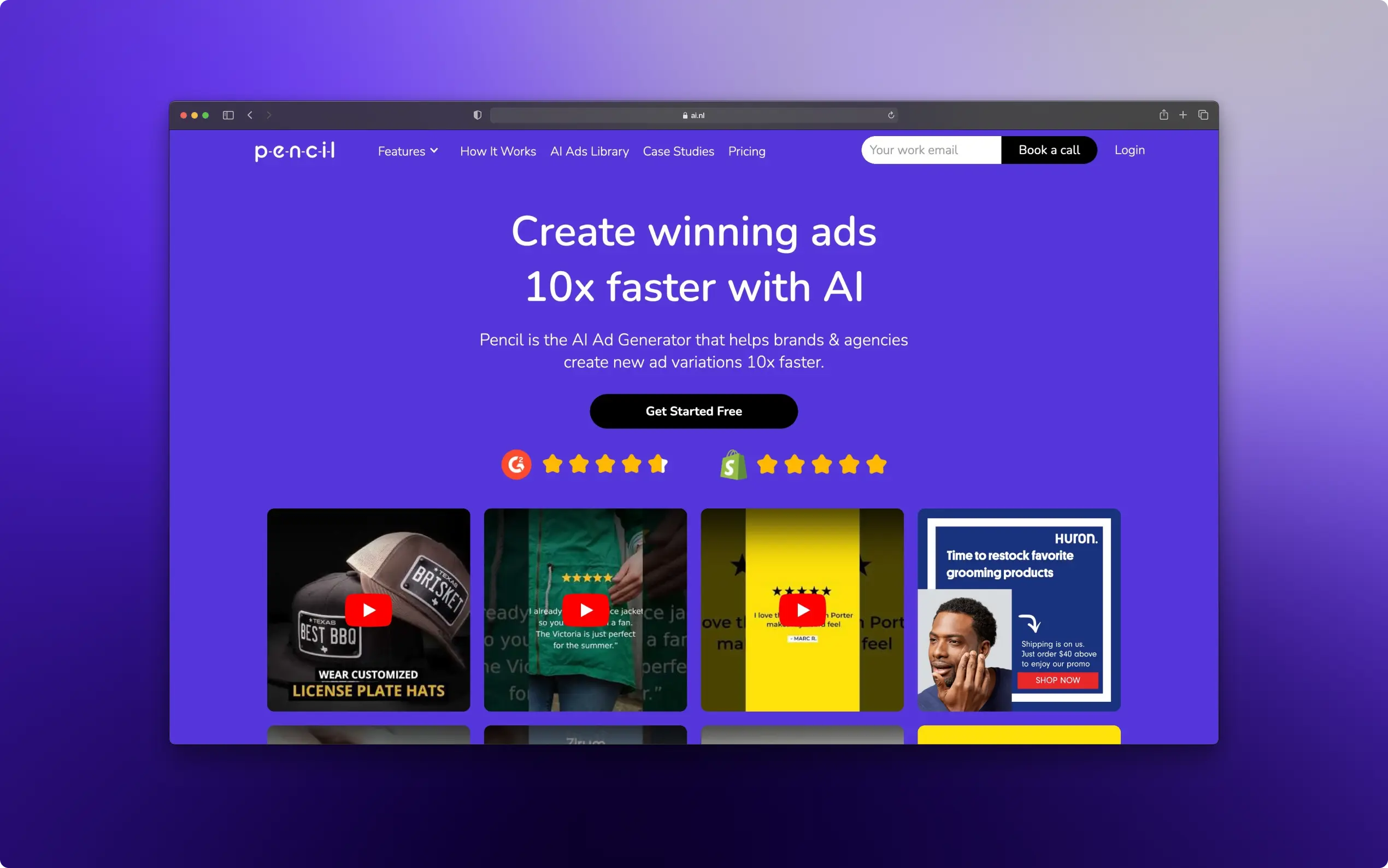
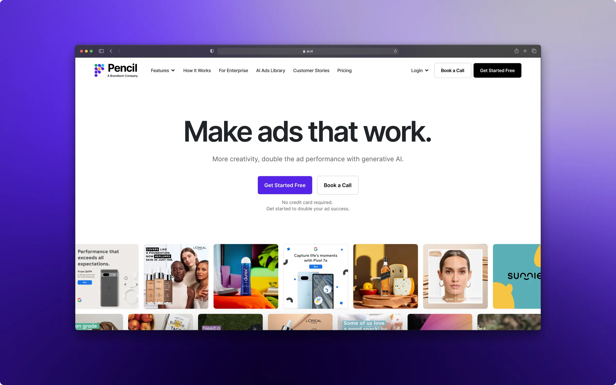
Pencil was acquired from BrandTech, a leading marketing technology group helping brands worldwide do their marketing better, faster and cheaper with the latest technology. As Pencil entered their next growth phase, their primary goal was to enhance its Go-To-Market website for elevated, global reach. The objectives were: to refine the brand identity for a cohesive web and marketing presence, restructure content across the site for better user engagement, and improve sales funneling to cater to the target audience effectively.
What we did for this project
Rebranding for Impact
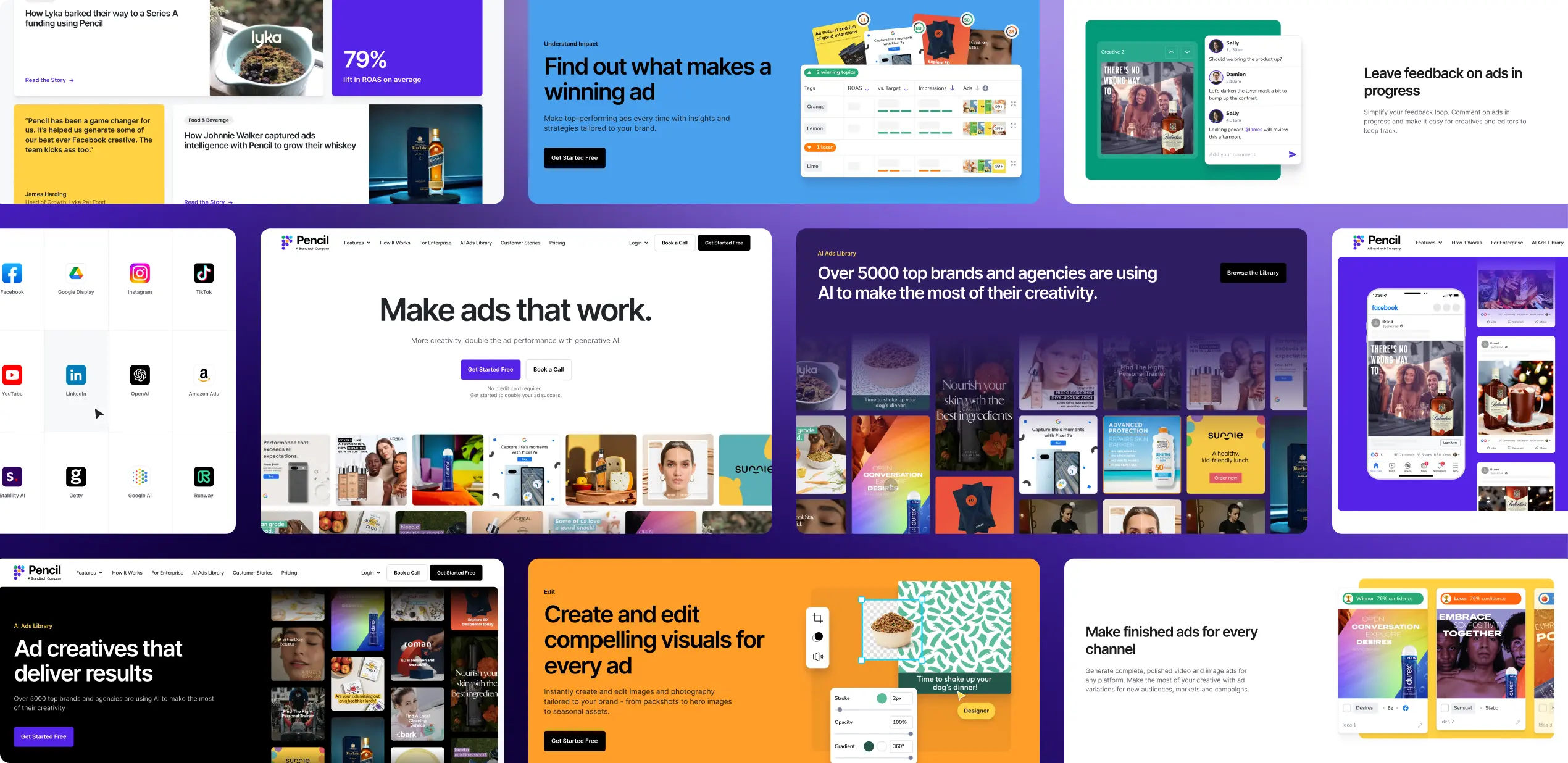
We embarked on a journey to revitalize Pencil’s online presence. The makeover included a fresh logo and a new brand color scheme to set Pencil apart in the competitive landscape. The website redesign put Pencil’s creative ad generation tools front and center, showcasing a broad spectrum of enterprise ad samples. This strategic move was aimed at drawing in more enterprise clients by highlighting the robust functionality and value of Pencil’s offerings.
Enhancing User Experience
Understanding the target audience’s roles and challenges was key. Through meticulous research, Noco identified the essential needs and preferences of ad managers, buyers, creatives, and marketing teams. This insight informed the website’s architecture and content strategy, ensuring an intuitive and engaging user journey. A significant part of this strategy was simplifying the customer journey. A visually engaging “How it Works” page, complete with video tutorials, demystified Pencil’s tools for users. Meanwhile, an “Ad Library” showcased the software’s capabilities through a variety of ad samples, reinforcing its value proposition.
Visual Communication
Noco tackled the challenge of communicating Pencil’s complex features through a simplified visual style. Custom graphics, tailored to the needs of different user groups, replaced raw product screenshots. This approach not only made the website visually appealing but also ensured that the content resonated with the intended audience.
Driving Conversions
Conversion Rate Optimization was a focal point of the strategy. Noco introduced an innovative end-of-page navigation feature, encouraging users to explore further without disruptions. Strategic placement of CTAs throughout the site, designed with compelling language and eye-catching colors, significantly improved user engagement and action-taking.
Project results
The results speak volumes. In just a month, Pencil saw a 68% increase in web traffic. This remarkable growth is a testament to the effectiveness of the rebranding and optimization strategies implemented by Okriya.
Related Projects:
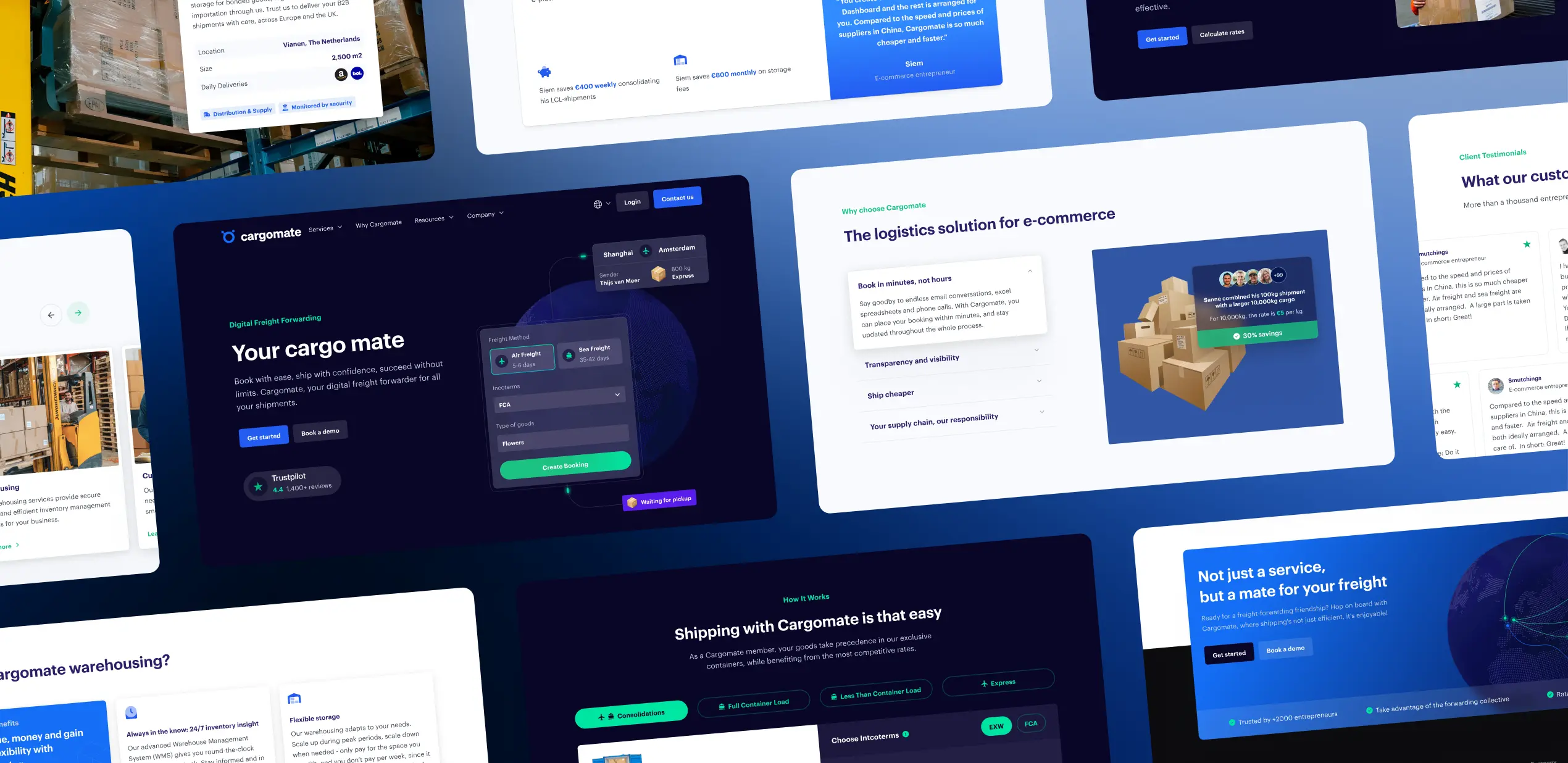
Cargomate’s Website Reconstruction
Scaling up a start-up: Full front-end and back-end redesign for Cargomate.

Pencil’s Go-To-Market website
As Pencil entered their next growth phase, their primary goal was to increase global reach.
