Cargomate’s Website Reconstruction
Industry:
Tech, Logistics & Transportation
Deliverables:
Rebranding Web Design, Interaction & Animation Design, Custom Webflow Development, Customer Journey Improvement
Duration:
8 Weeks
Technologies:
Figma, Hubspot, Webflow
Project overview
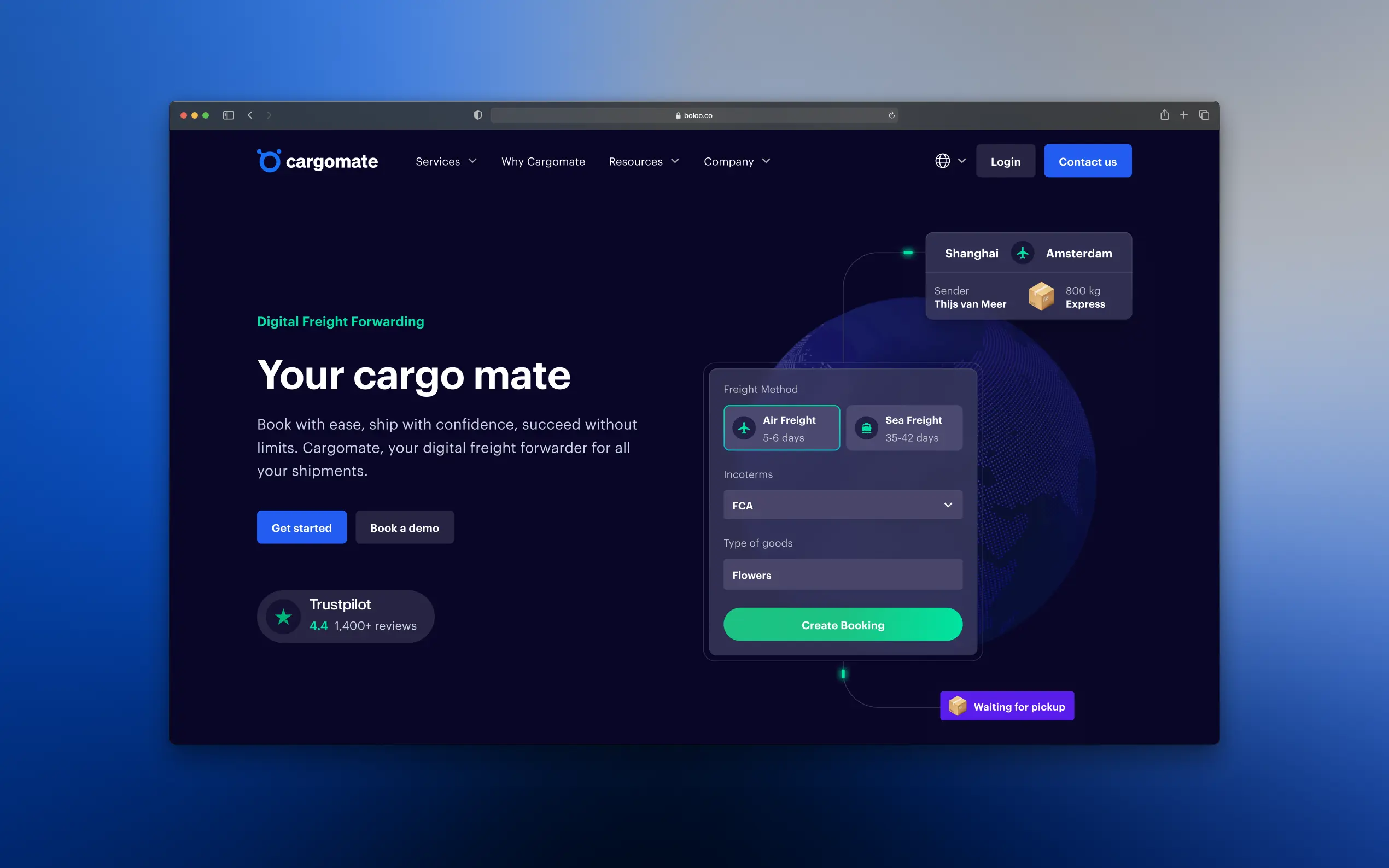
The primary objective was to introduce a new, unique branding & website that resonates with a younger, tech-savvy audience, differentiating from the conventional corporate aesthetics among competitors. Setting itself up as a trustworthy partner rather than just a supplier meant that our designers had to create a visual style that matched their modern tone of voice and brand identity. We also had to optimize several processes in the back-end of the website to bring down operating costs.
What we did for this project
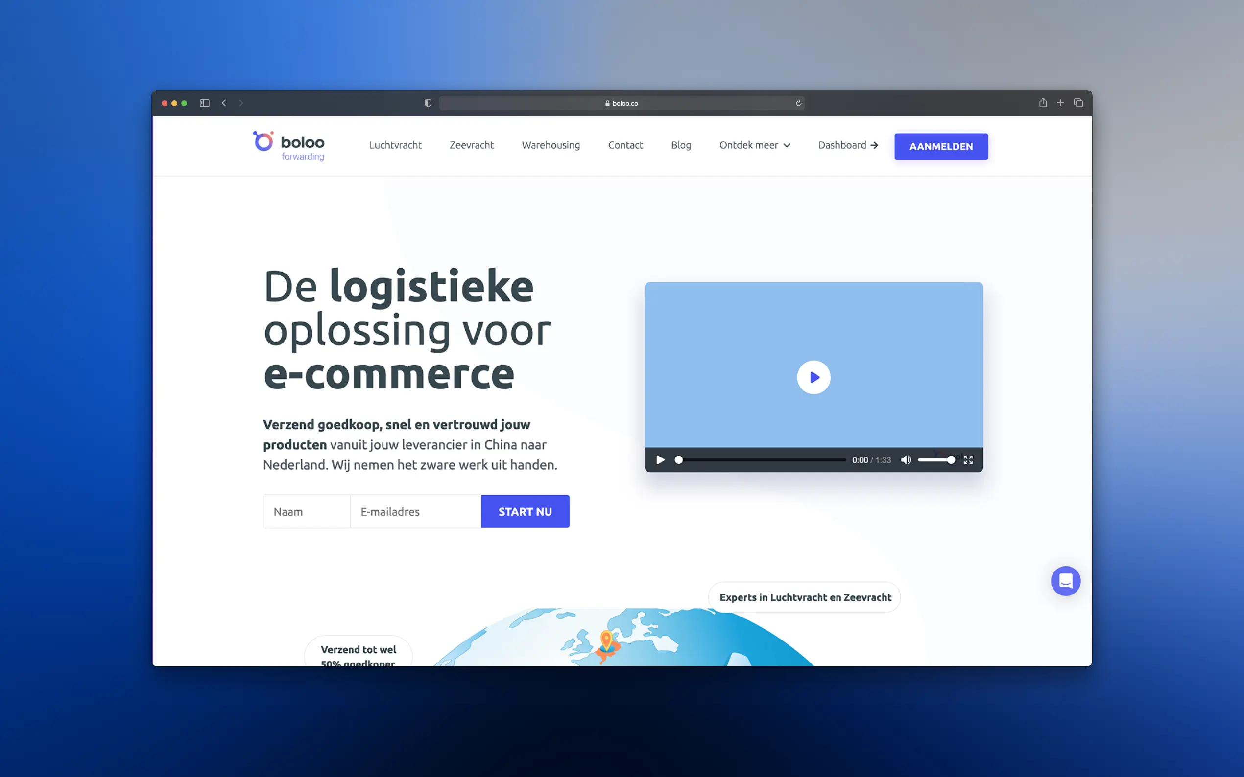
We examined the previous website to identify pain points. It was evident that crucial information about shipping routes and options was unclear, and the text-heavy shipping process section did not engage users effectively.
- Market analysis & brand refreshing: We dove deep, analyzing the logistics landscape to position Cargomate as the vibrant, dynamic newcomer among the old guard. The goal was clear: professional yet approachable, sophisticated yet relatable.
- User-centric design: Through user personas and competitor analysis, we painted a picture of Cargomate’s audience—e-commerce pioneers craving simplicity and reliability. Our design mantra? Simplify, then amplify.
- Out with the old, in with the intuitive: The old website was a maze; we turned it into a straight line. By introducing interactive modules like rate calculators and simplifying shipping options, we transformed confusion into clarity.
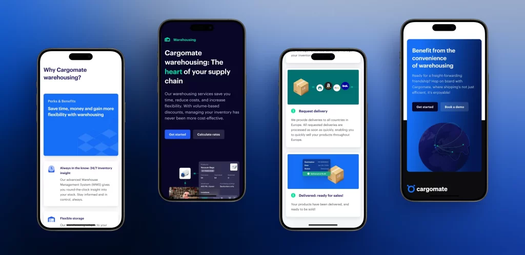
- Visuals that communicate their business: We replaced text-heavy explanations with engaging graphics, walking users through Cargomate’s process in a visually intuitive manner. The color palette? A blend of trust-inducing blue and green, accented with icons and visuals that made complex shipping processes digestible.
- CTAs that click: Strategic placement of clear, compelling calls-to-action now guide users effortlessly towards making decisions, whether it’s getting a quote or diving into the specifics of shipping rates.
Project results
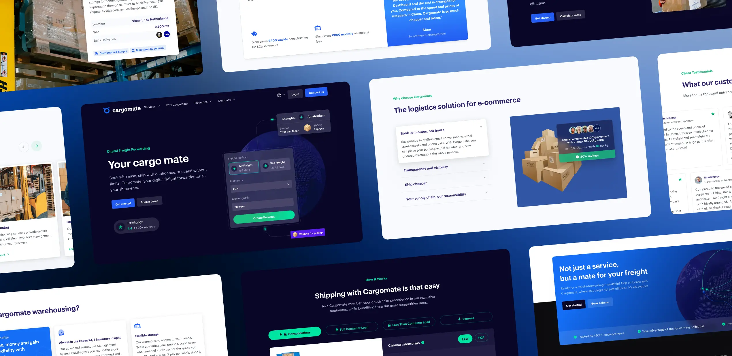
Cargomate’s website transformation was a strategic overhaul that placed user experience at the forefront. Today, Cargomate’s website communicates the power of understanding your audience and delivering what they seek—simplicity, reliability, and a touch of modernity.
Related Projects:
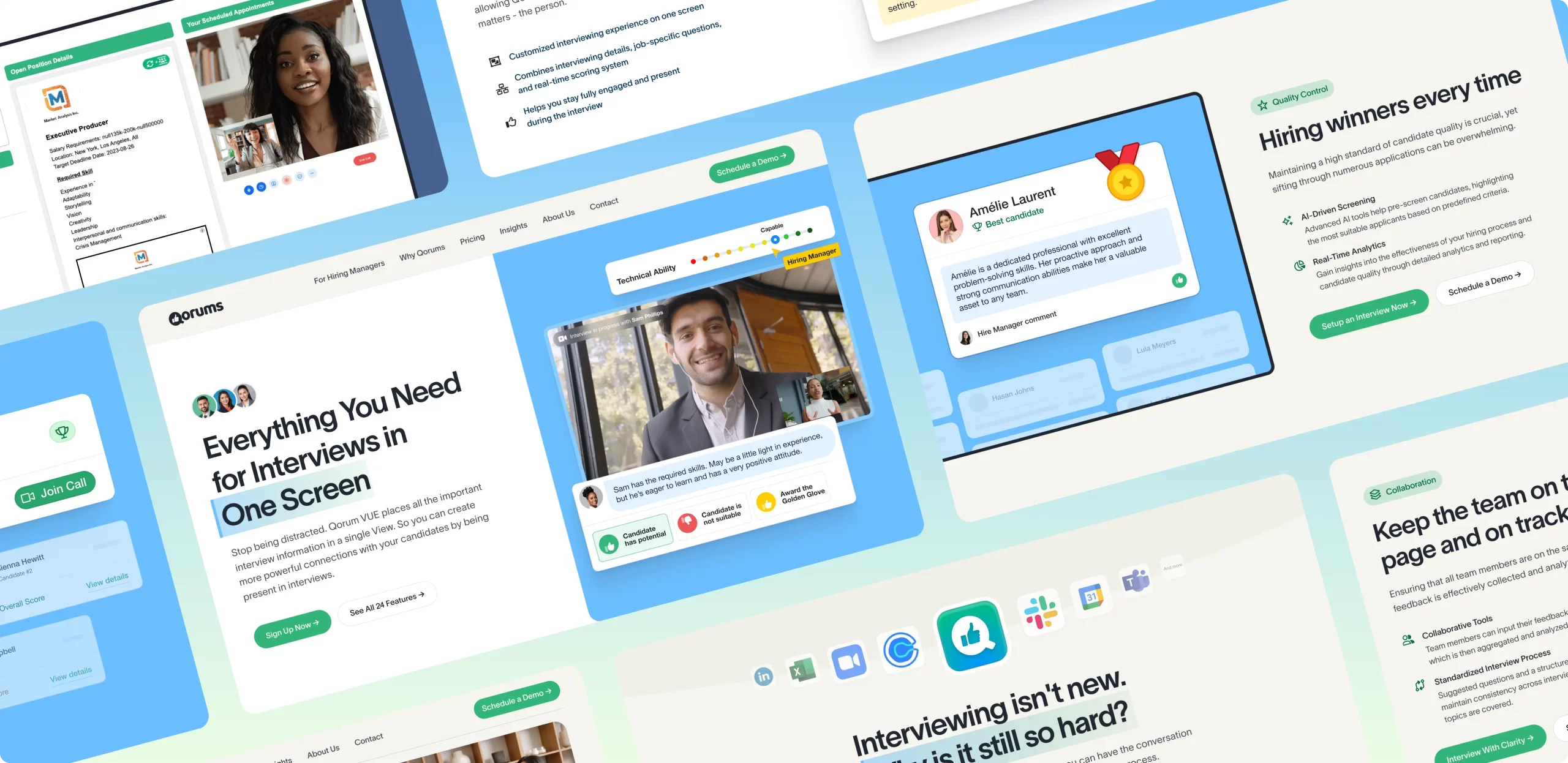
New Go-To-Market website for Qorums
Within the competitive landscape of the US, Qorums needed a new Go-To-Market website to launch ASAP.
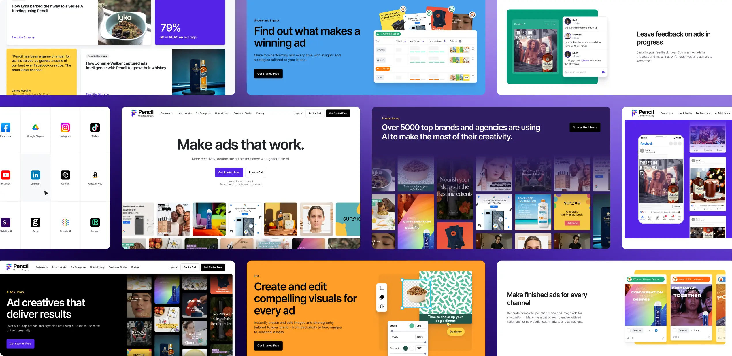
Pencil’s Go-To-Market website
As Pencil entered their next growth phase, their primary goal was to increase global reach.
