New Go-To-Market website for Qorums
Industry:
SaaS for recruitment
Deliverables:
Custom Webflow Development, Rebranding, Web Design, Interaction & Animation Design, Webflow Implementation
Duration:
5 Weeks
Technologies:
Webflow, Figma
Project overview
Let’s dive into our latest work on Qorums, a burgeoning startup with a mission to revolutionize the hiring scene. Nestled within the competitive landscape of the US, Qorums is a lean team of go-getters who’ve crafted ‘Qorums VUE’—the only platform you’ll ever need to streamline the interview process by organizing candidate details, generating key questions, and enabling real-time scoring, all in one sleek interface.
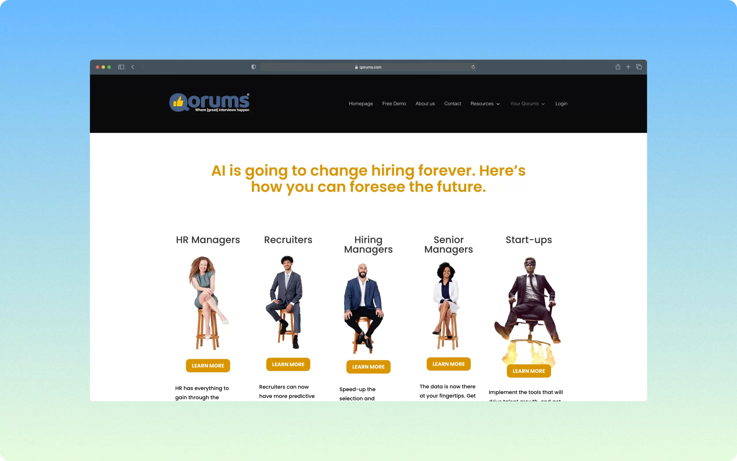
Despite their innovative solution, Qorums faced a pivotal challenge. With a new Go-To-Market (GTM) site on the horizon, coupled with a relaunch of their SaaS platform, Qorums needed a digital space that highlighted their unique selling propositions (USPs) to their target audience and also drove significant trial sign-ups. The task was to build a clean, modern website that could evolve with their brand while providing a seamless onboarding experience for users to easily take ownership post-launch.
What we did for this project
Given Qorums’ stage and specific needs, our strategy was anything but ordinary. Our challenge was twofold: to create a visually engaging website without an idea what the final final SaaS product would look like, and to ensure it effectively communicated the value of Qorums’ offerings.
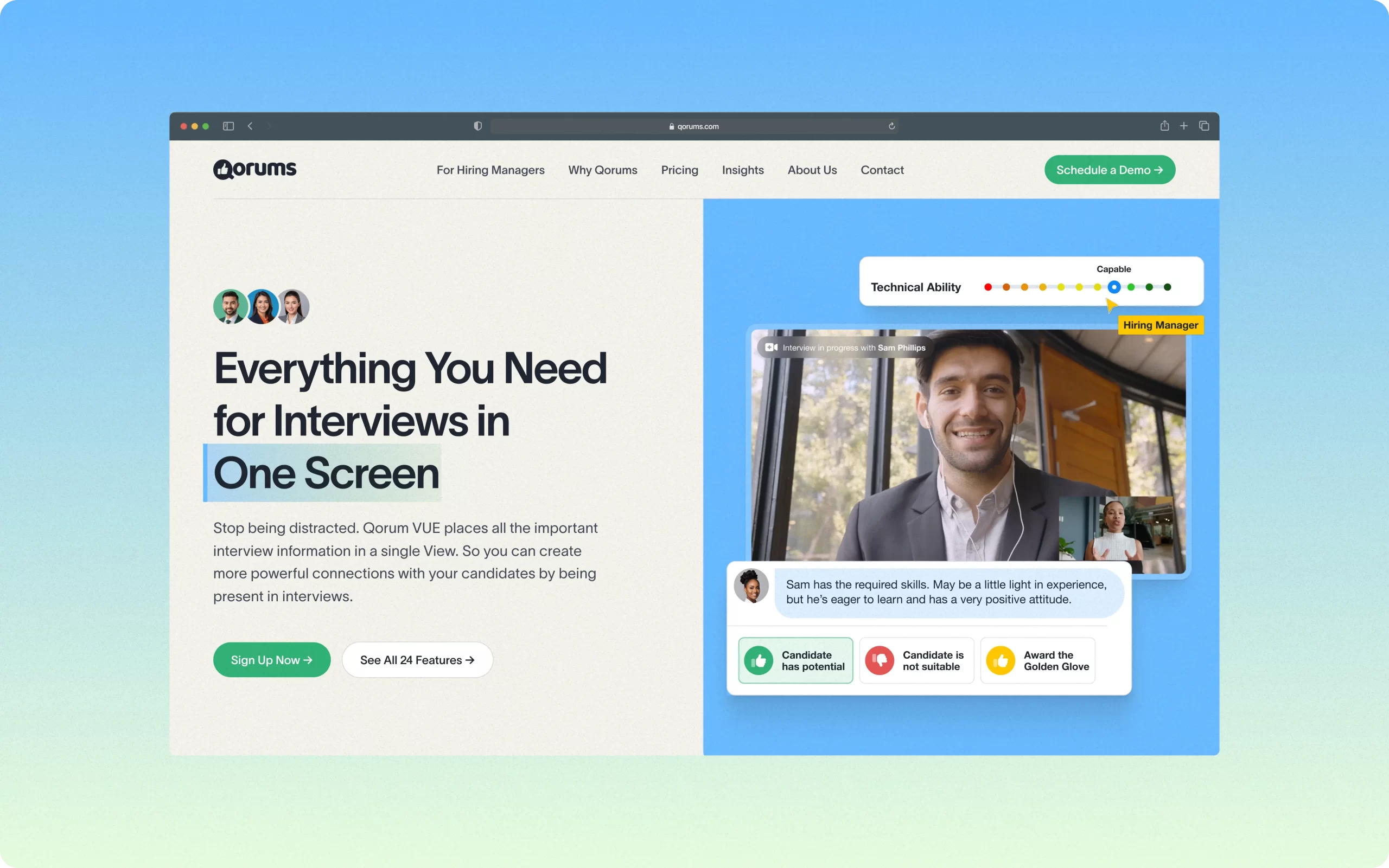
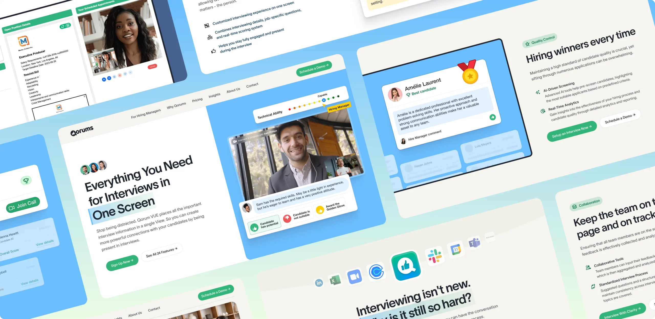
- Collaborative Design: We kicked off by working closely with Qorums to understand the essence of each product feature. By artistically recreating these features, we produced stylized visuals that not only matched but exceeded the aesthetic appeal of actual product screens. This approach ensured that every visual was not just eye-catching but also functional, making the complex simple.
- Optimizing Customer Journeys: Understanding that our audience included HR managers and recruiters, we meticulously structured the website’s content and navigation to cater to these specific roles. Our optimized information architecture helped potential users navigate the site with ease, ensuring they found relevant information swiftly and smoothly.
This strategy enfolded into a website with thoughtful design and strategic execution. Here’s what we rolled out:
- Visuals and Graphics: We deployed graphics that broke down the all-in-one-screen interview process, showcasing Qorums’ features through clean, understandable visuals. The chosen color palette of blue and green reflects professionalism andinstills a sense of trust among site visitors.
- User Experience Design: With simplicity at the core of our design principles, we utilized icons and minimalistic layouts to convey information effectively. We steered clear of overwhelming animations, focusing instead on clarity and communication.
- Conversion Optimization: The website features strategically placed calls-to-action (CTAs), using friendly language and contrasting colors to draw attention and encourage actions. Whether it’s getting started or scheduling a demo, each CTA is designed to convert interest into action.
- Engaging Animations: Our pièce de résistance is a hero video that captures a live interview scenario enhanced with key UI elements from Qorums. This not only demonstrates the platform’s capabilities but also adds a personal touch, making the digital experience feel more human and relatable.
Related Projects:
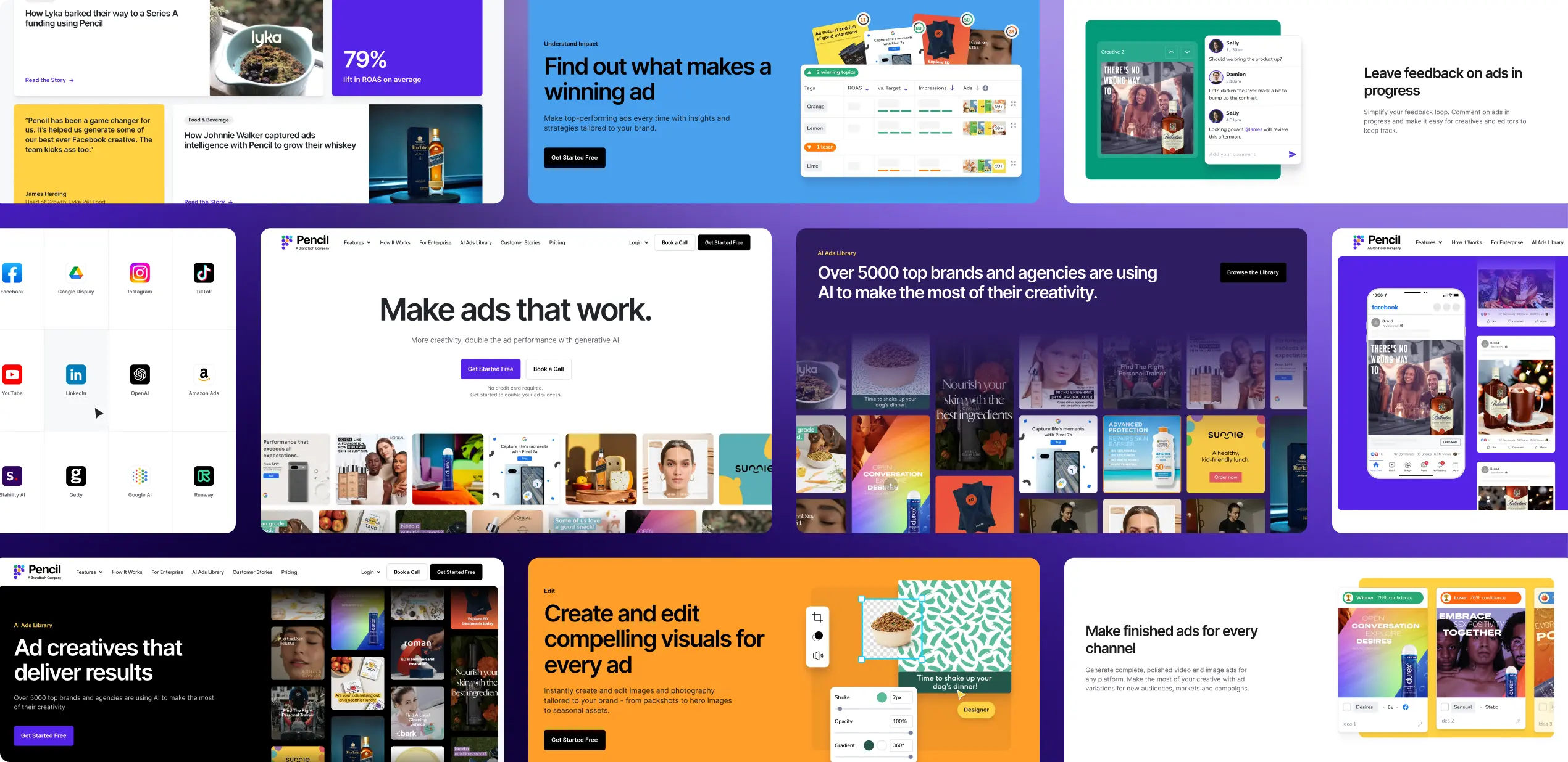
Pencil’s Go-To-Market website
As Pencil entered their next growth phase, their primary goal was to increase global reach.
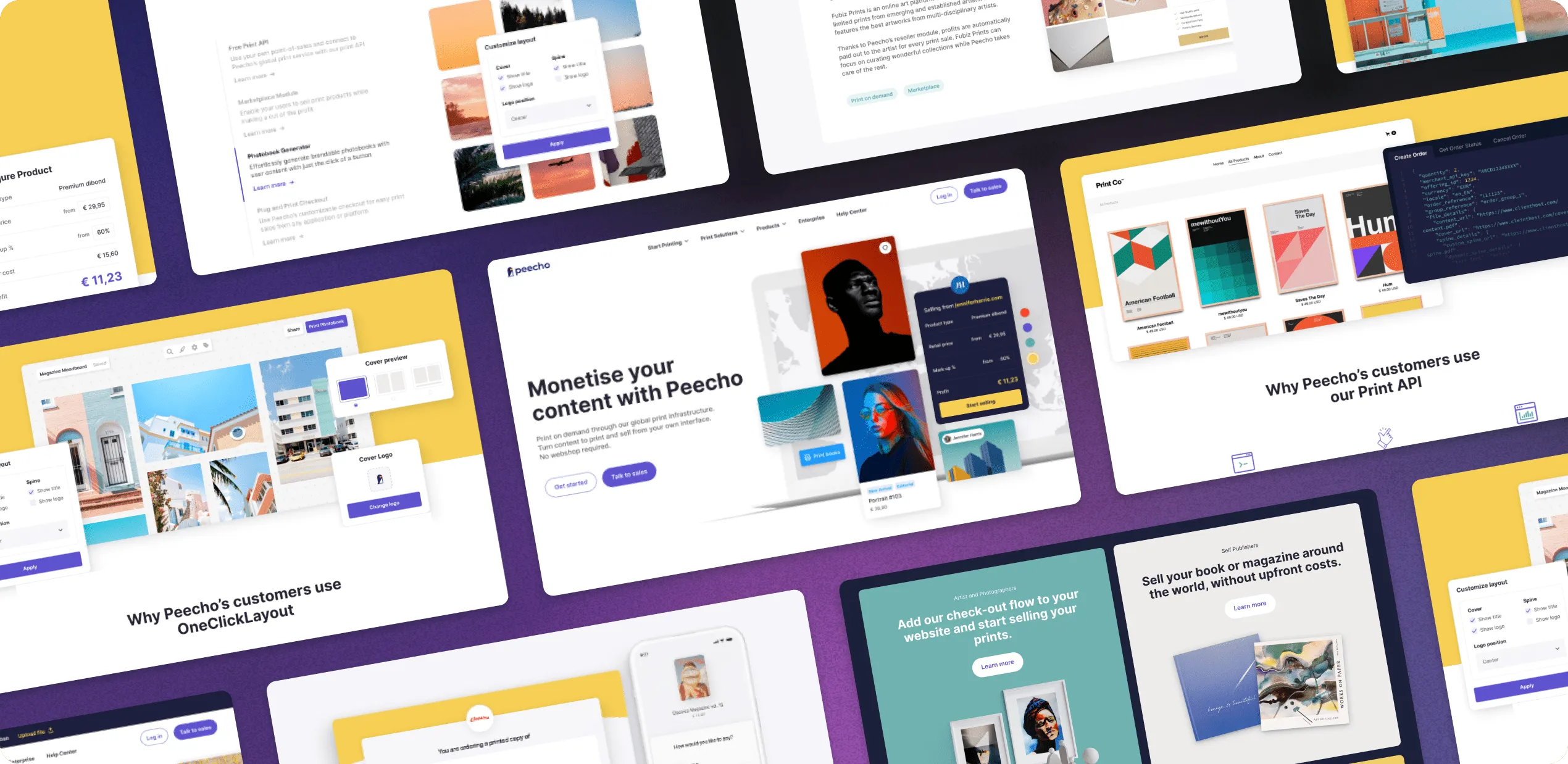
Peecho’s Web Redesign
Peecho skyrockets online growth with their new website, 184% increase in conversion rate.
